Spin sportwear
MDI- UPV 2017
01. Overview
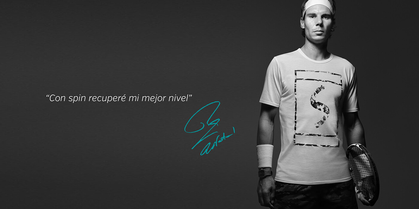
Spin is a sports brand created in Spain as part of the Visual Identity course during the MDI program. Developed by a team of four designers, the project aimed to visually establish the brand from the ground up.
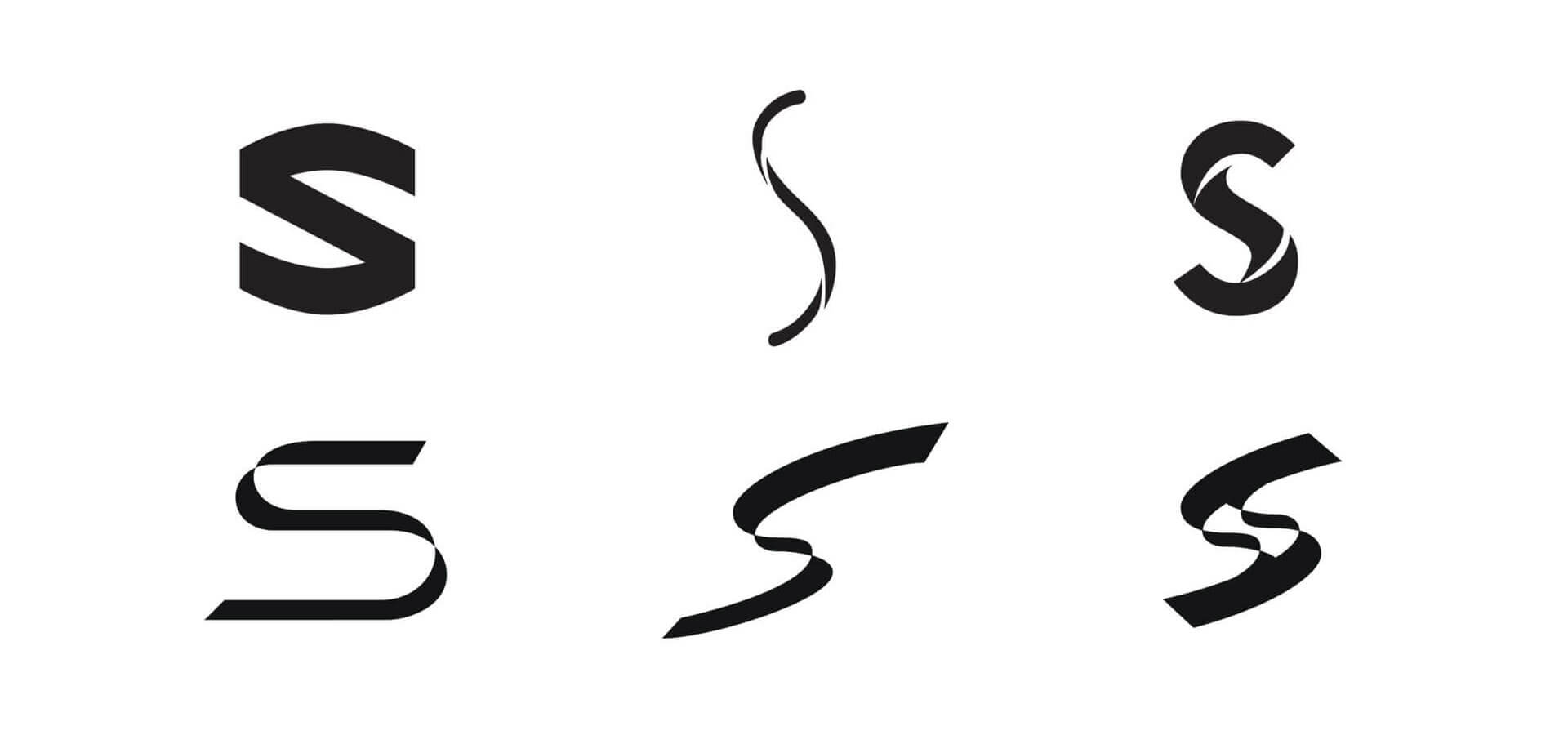
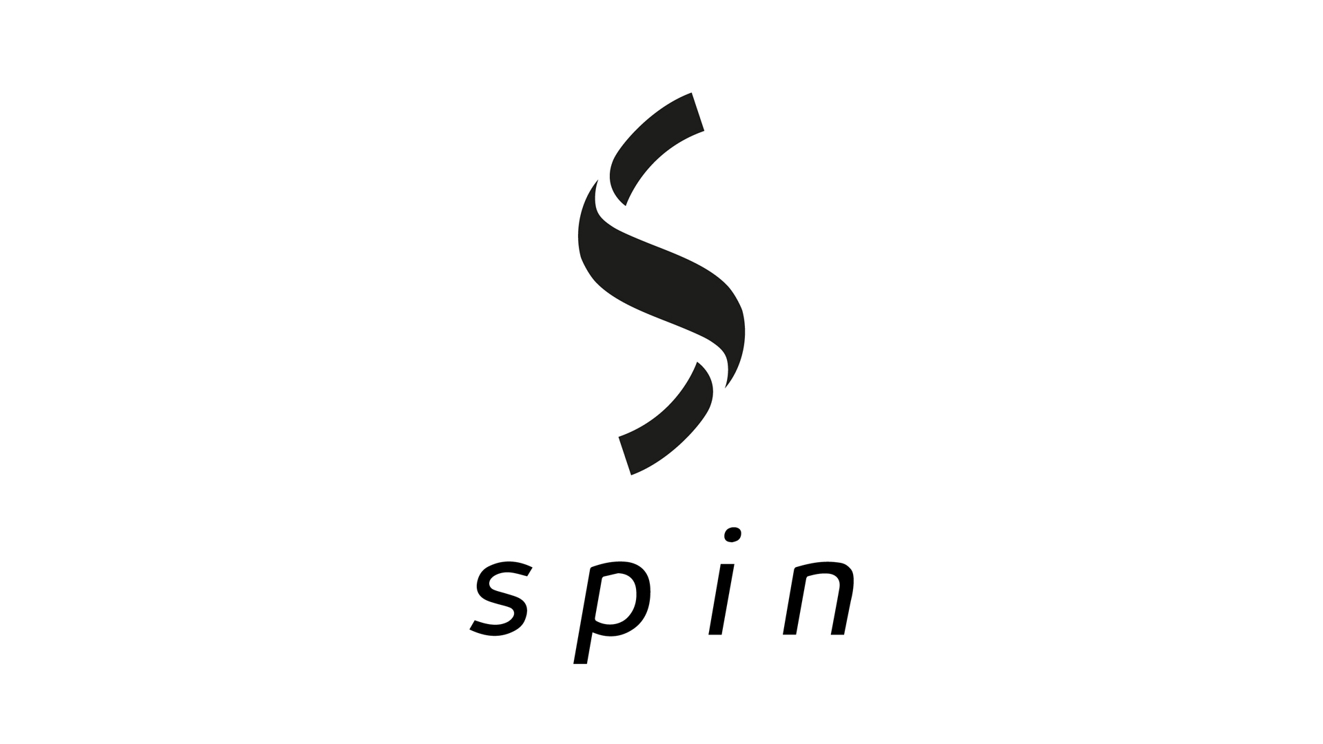
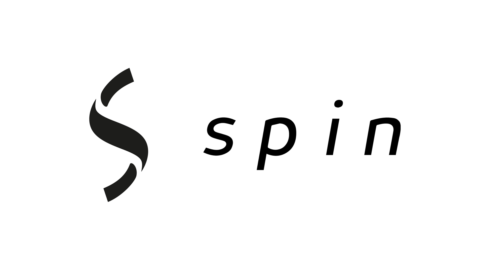
The concept was inspired by the name “Spin,” focusing on movement and incorporating the idea of an ambigram in the logo design. Additionally, Spin operates as an environmentally conscious brand, committed to sustainability and eco-friendly practices.
02. Key Insights
Where:
Valencia, Spain
What:
Visual brand design
Category:
Sports apparel & equipment
Role:
Designer – student
Team:
4 person team
Duration:
One week
03. Objectives
- Develop a unique sports brand identity based on the name “Spin,” emphasizing movement and dynamism.
- Incorporate the concept of an ambigram into the logo, with a design that can be interpreted from multiple perspectives.
- Establish Spin as a green, eco-conscious brand, reflecting a commitment to environmental responsibility.
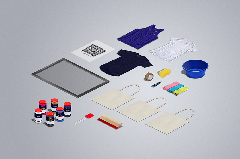
- Create a cohesive visual identity that can be applied across various platforms, including packaging, apparel, digital media, and promotional materials.
- Foster strong collaboration between the four designers involved, ensuring that each aspect of the brand reflects a unified and coherent vision.
04. Design
The process began with research on the sports industry and sustainability trends to gather inspiration focused on movement and environmental consciousness. Next, we moved into the concept development phase, followed by logo design, selection of color and typography, application of the visual identity, and finally, gathering feedback and making refinements
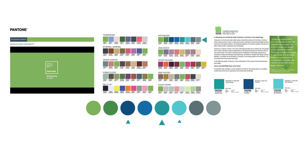
04.4 Color Pallete
A palette of green and blue colors based on the eco concept.
04.5Visual aplications
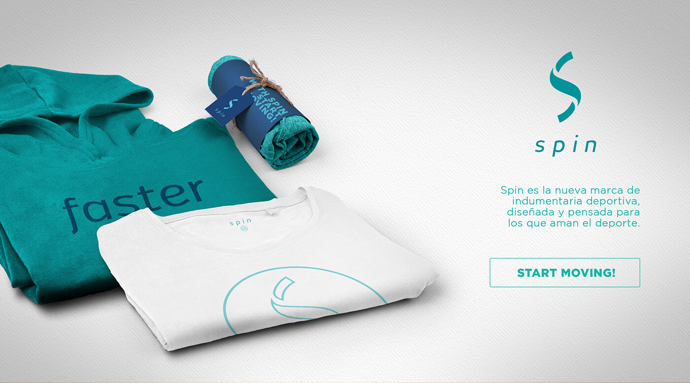
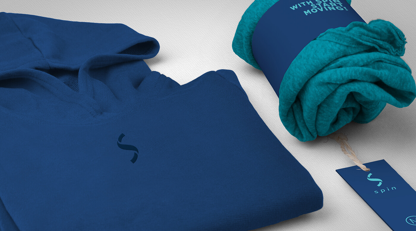
Sportwear
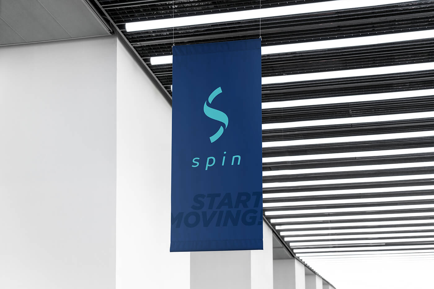
Logo aplications
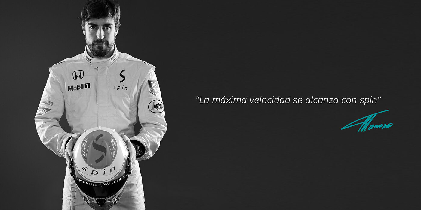
Advertizing
06. Results
- A visually dynamic brand was successfully created, centered around the concept of “Spin” and its connection to movement and energy.
- The ambigram logo effectively captured the essence of the brand, offering a visually engaging and memorable design that reinforces the idea of rotation and duality.
- Spin was established as an eco-friendly brand, emphasizing its commitment to sustainability, which resonated with environmentally conscious consumers.
- A consistent visual identity was applied across various mediums, including packaging, clothing, digital platforms, and promotional materials, ensuring uniformity and recognizability.
- The collaboration between the four designers resulted in a unified, well-executed brand, with clear communication of the concept and values.


