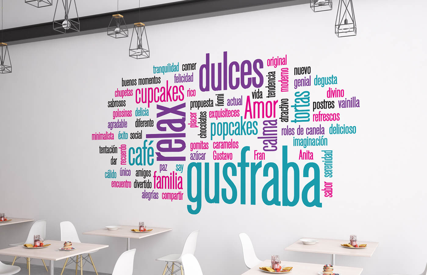
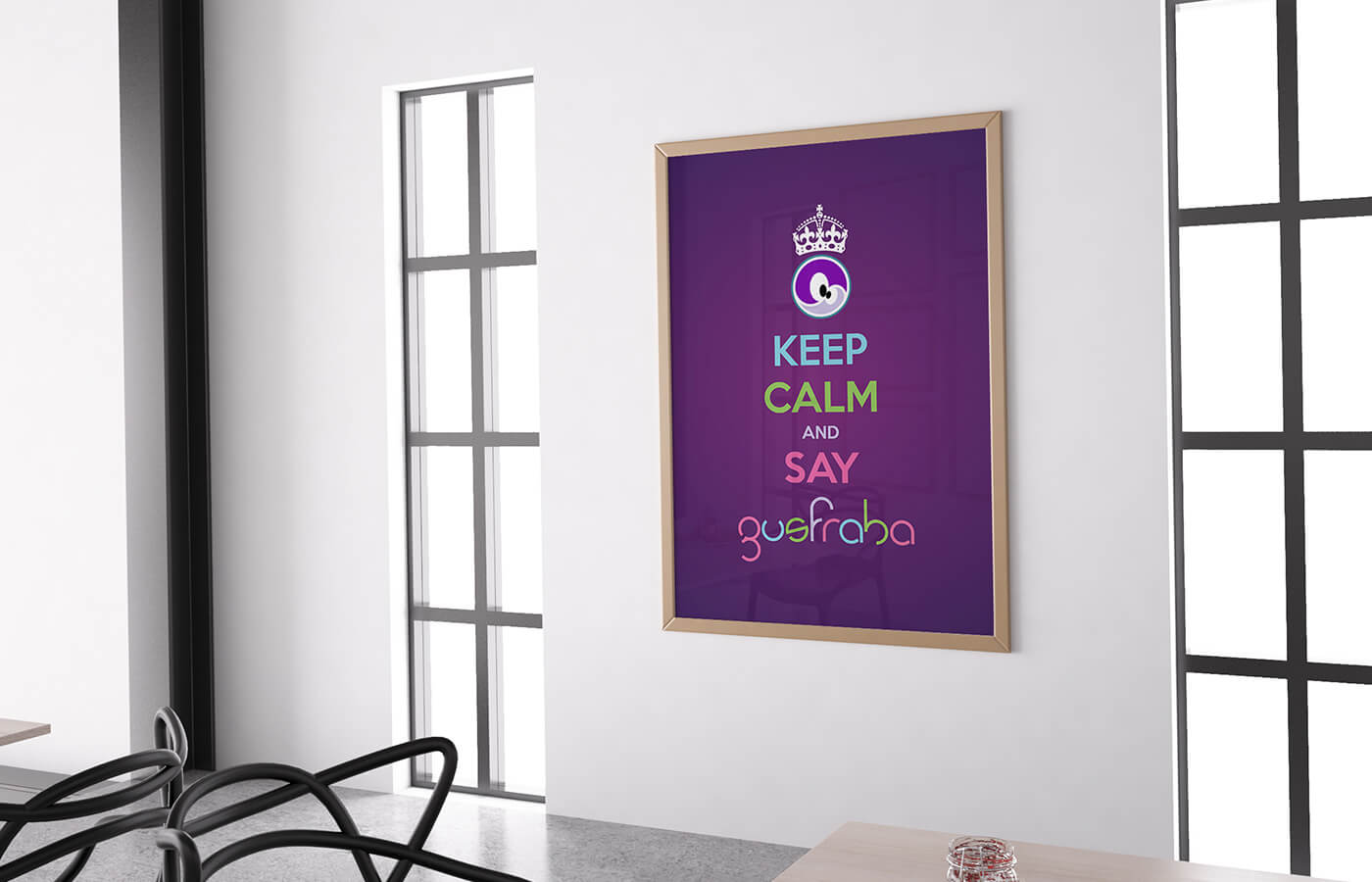
Gusfraba is a handcrafted cupcake brand whose name is inspired by the expression “Goosfraba” from the film *Anger Management*, used to calm individuals in moments of frustration.
This concept forms the foundation of the brand’s visual identity, aimed at creating a warm and inviting atmosphere that also evokes a sense of playfulness. Gusfraba cupcakes are crafted to offer customers a moment of relaxation and enjoyment, providing a delightful break in their day.
02. Key Insights
Where:
Mérida, Venezuela
What:
Cupcake visual brand
Category:
Food – Deserts
Role:
Graphic designer
Team:
Freelance
Duration:
4 weeks: part-time
03. Objectives
1. Ideate a visual concept for the brand.
2. Create a new typography for the logo.
3. Choose a fun and modern color pallette.
4. Design the stationery, packaging and other P.O.P. material.
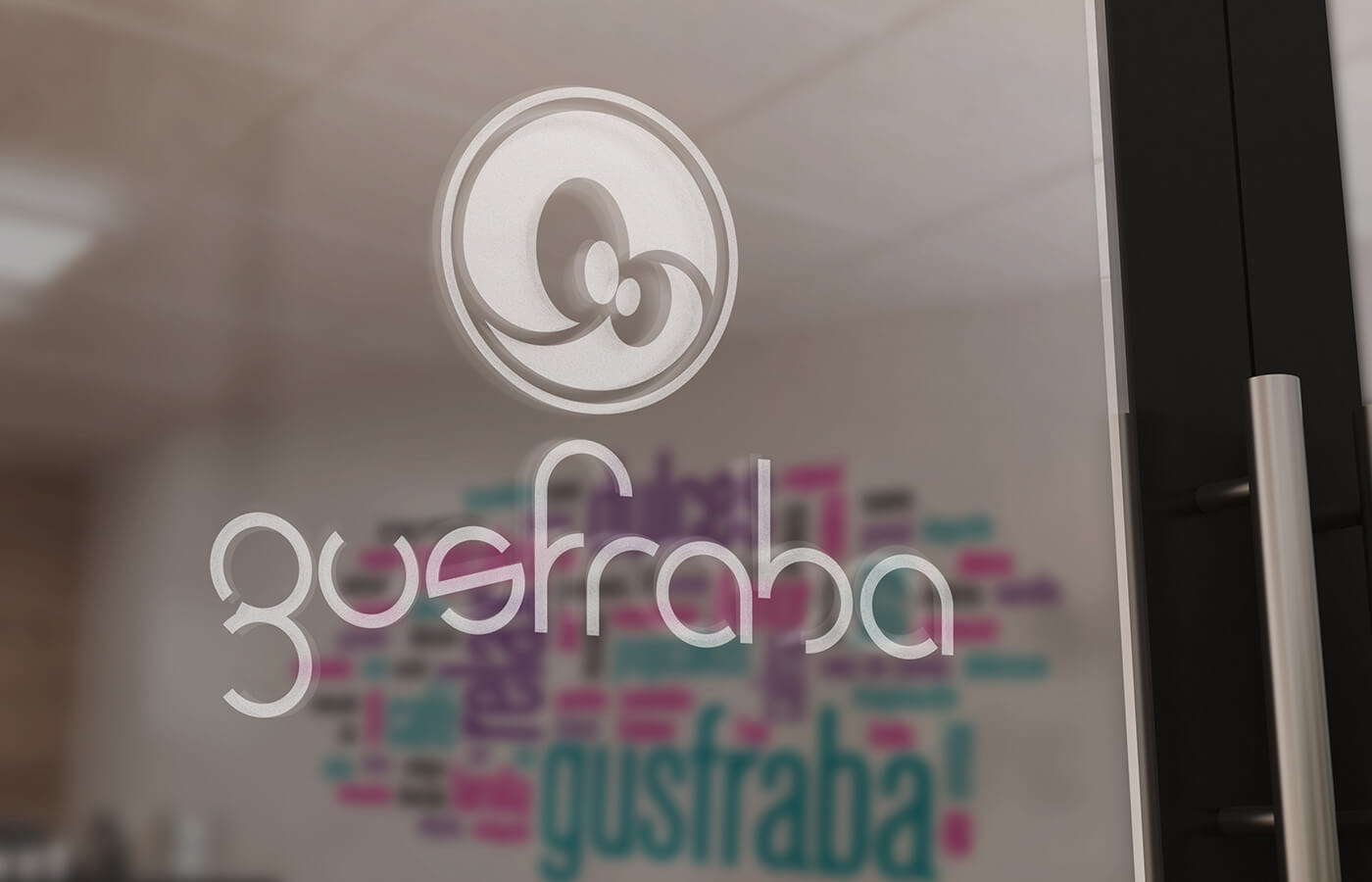
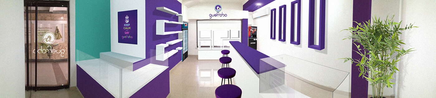
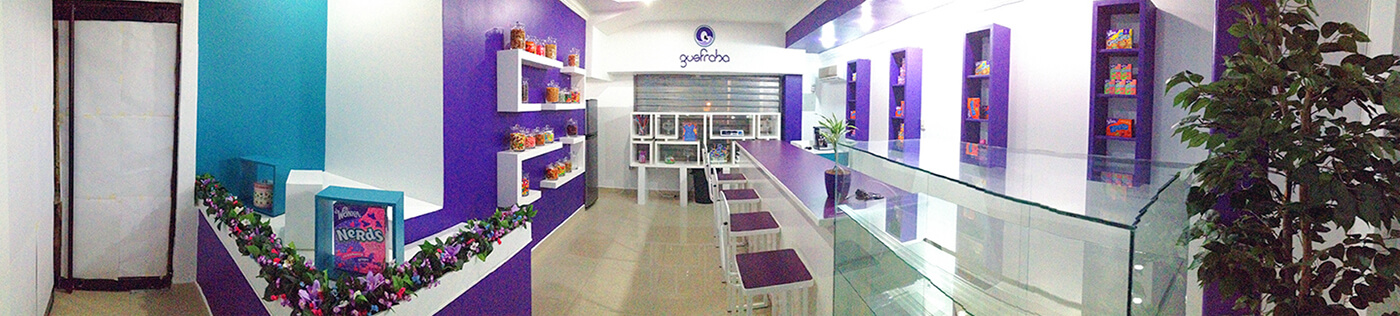
5. Use the visual brand in the interior design of the store.
04. Design
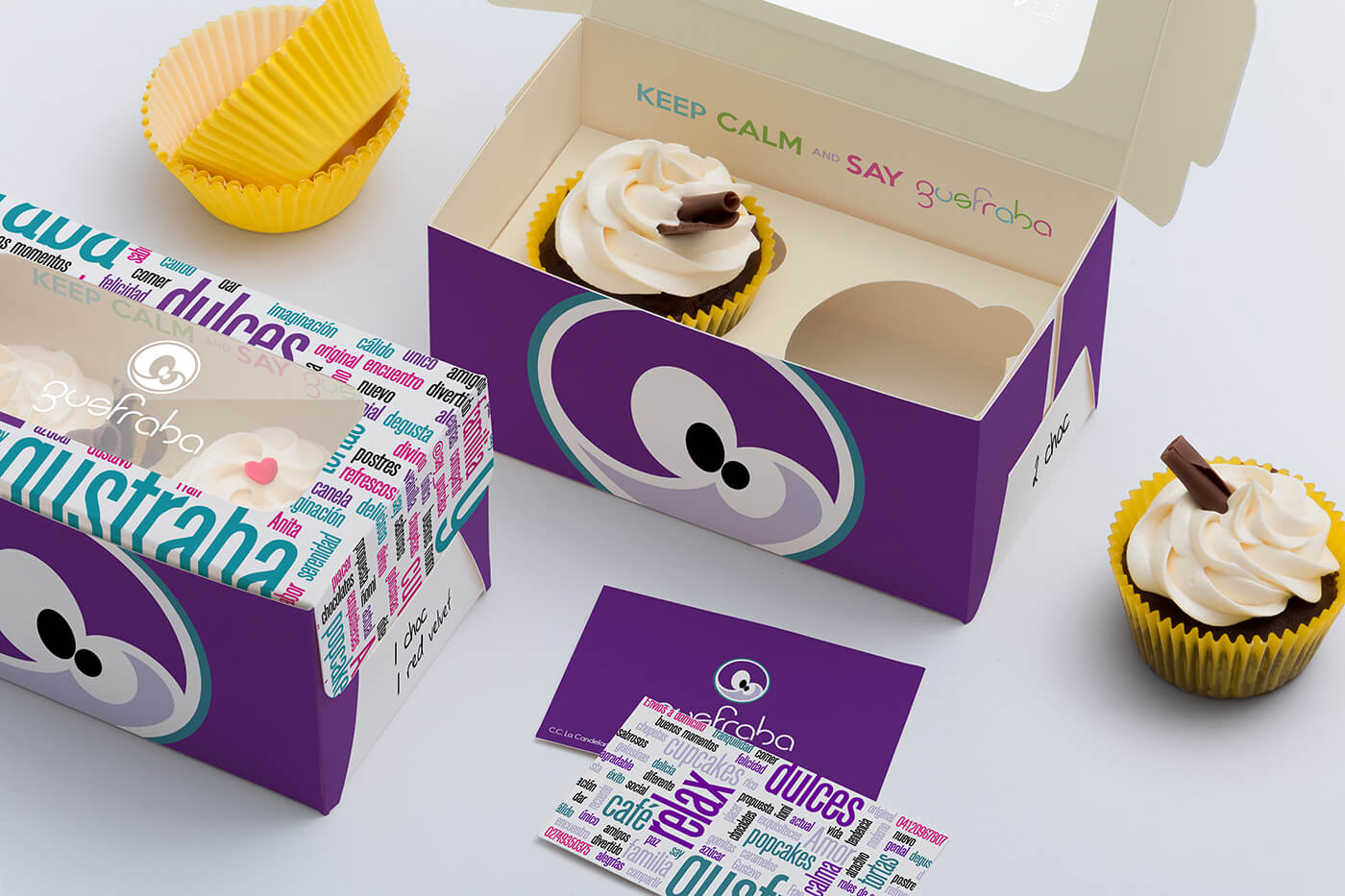
Using the concept of balance, relaxation and playfulness the primary image is based on the yin-yang symbol and a friendly face. Candies, lollipops, donuts, cakes, and some chocolates… most of the sweet things are round-based shapes. This round concept was used to create the grid for the logo typography and the iconic yin-yang face.
05. Colors
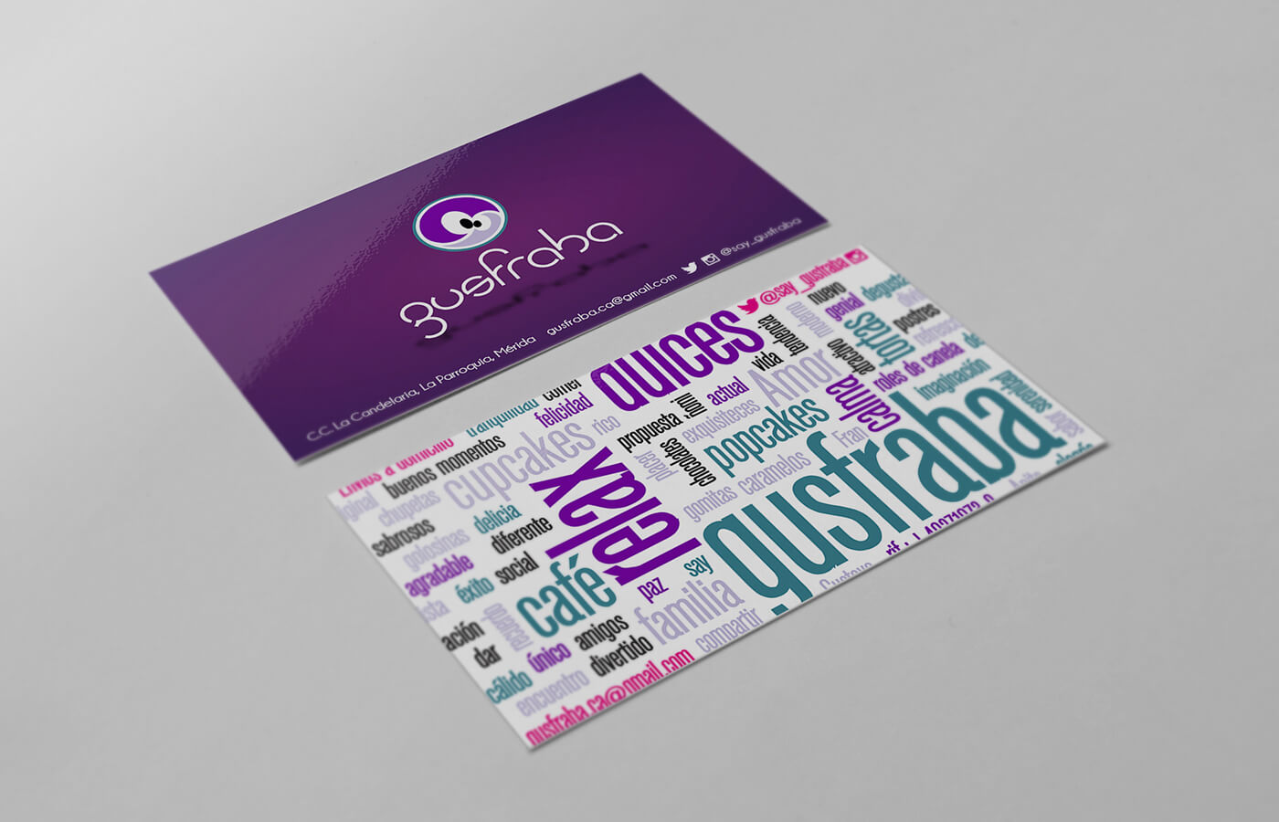
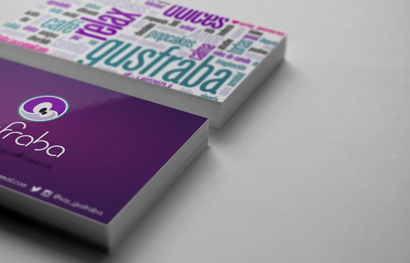
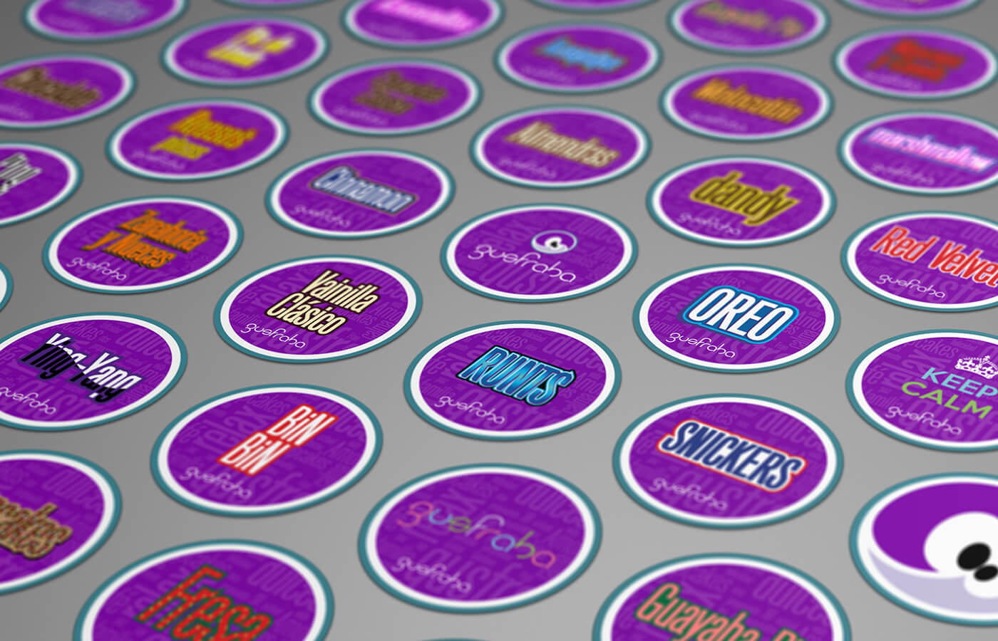
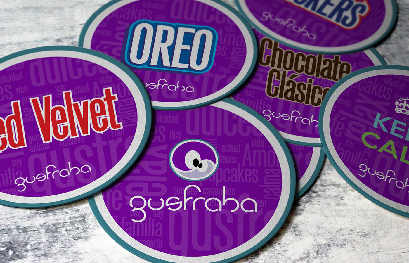
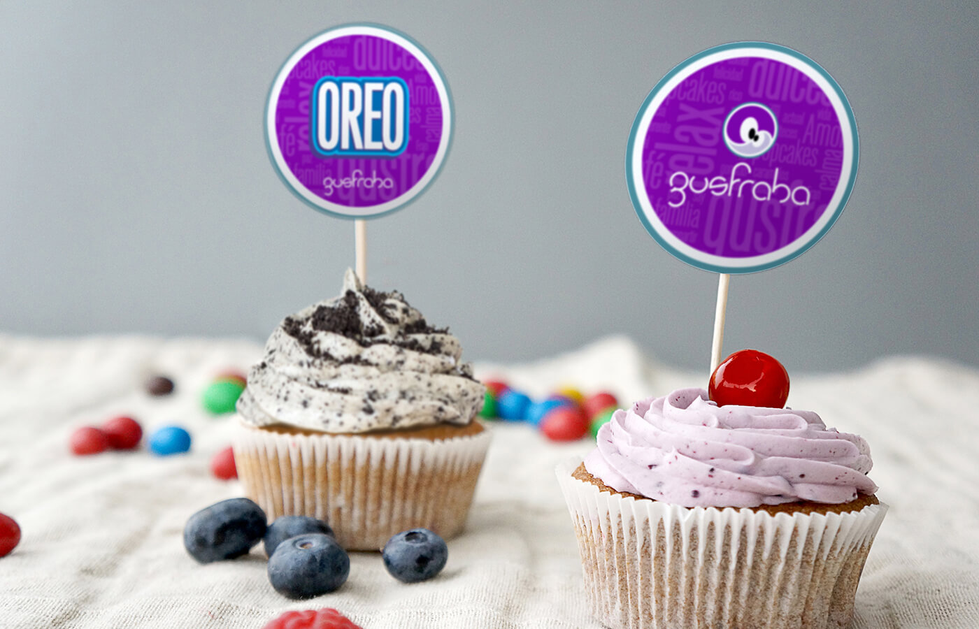
The color pallete has it´s inspiration in the chocolate sparkles, the primary color is a dark violet and the secondary is an aquamarine tone. There is a complementary clear violet tone and a fuchsia for high contrast also with use of black and white.
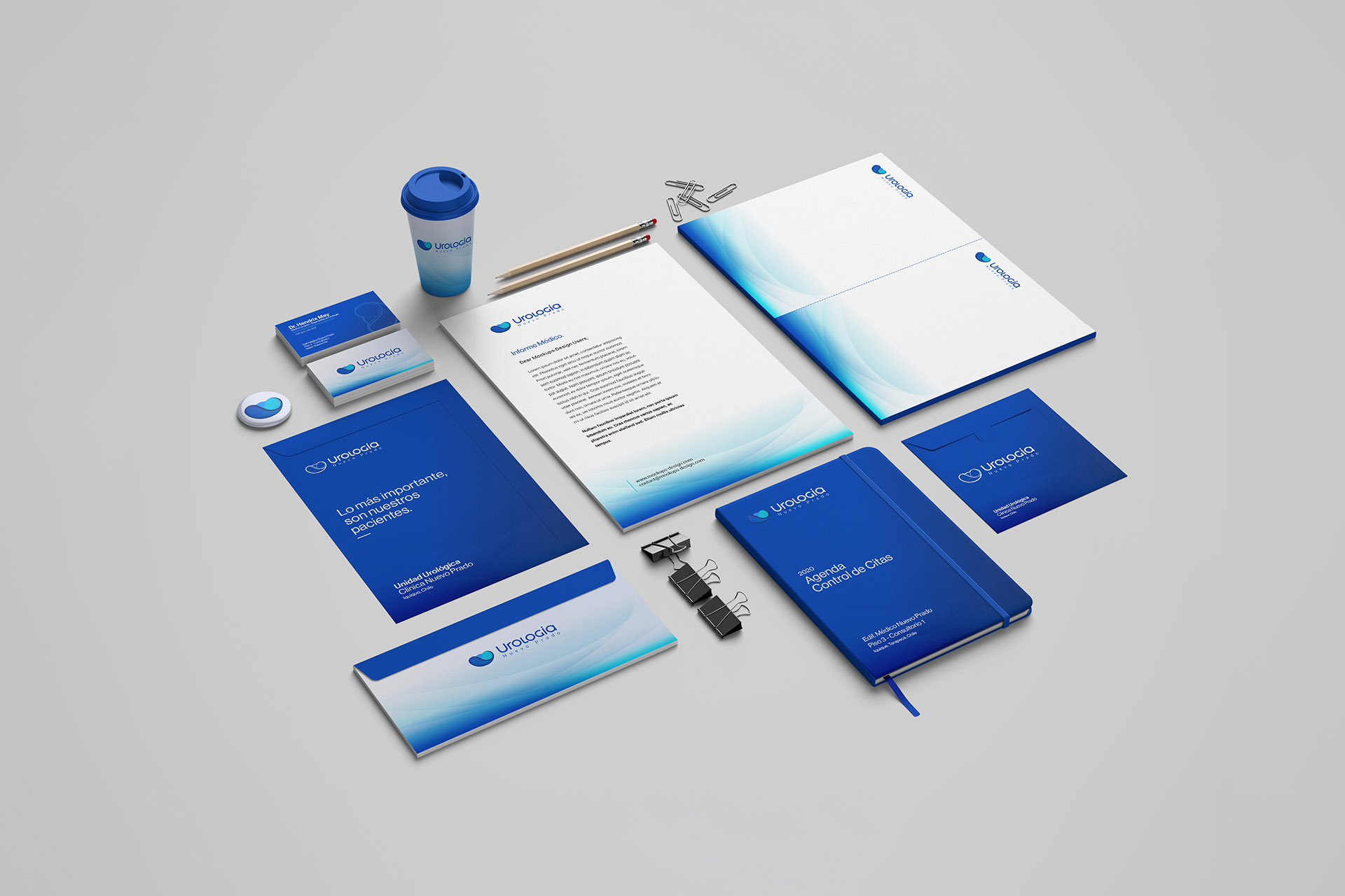
06. Applications
Business cards and packaging:
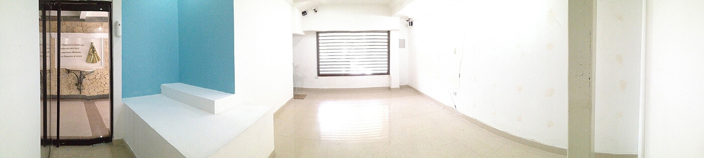
Store details:
Flavours:
07. Tools
08. Results
The new visual identity successfully positioned Gusfraba as a charming and inviting cupcake and sweet shop. The warm color palette and playful design elements created a memorable brand that resonated with the local community.
Despite being a new business, the fresh branding sparked curiosity and interest among potential customers. Initial feedback has been positive, with many praising the design as appealing and welcoming.
The design enhancements improved the presentation of cupcakes and sweets, making them more visually appealing. This thoughtful packaging design and presentation contributed to a strong first impression, encouraging customers to explore the offerings.
The inviting branding led to early word-of-mouth recommendations among customers. Friends and family who visited the shop shared their experiences, helping to establish a foundation for customer growth in the local market.